Introduction
—
This manual provides a description of single graphic elements and continues with providing directions regarding the use of brand in terms of size, color and possible locations; defines its proper and improper use.
It is the document that fixes the basic terms of correct modes and the use applications of the brand Fabbrica del Tempo, defining its entire visual identity.

Brand and Logo design
—
—
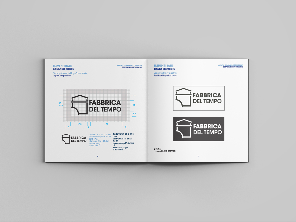
The design of the brand follows a simplification process of Vitali’s factory.
After careful analysis of the sources emerges the love and respect for the environment, especially for structure, as evidenced by the desired restoration project. The iconographic choiced focuses on the main facade and on various parts that make it up.
It emerges immediately the bizarreness of turbines, becoming the uniqueness element of structure, from here you can imagine the design of the brand process. The exterior and interior are combined into a single visual image.
This simplification is based on two basic factors: the use of a single lines thickness that make up the drawing and the elimination of any light-shadow and three-dimensional effect.
The symbolic figure of the turbine is expressed in a simple curve that exceed the building margins, in order to get more emphasis and at the same time communicates the water function of the latter. The result is an essential, functional and well harmonized design.
The choice of typeface finds in ITC Avant Garde font a valuable support that confirms the continuity of forms and proportions. It expresses a typographic identity, able to interpret its history and present of Time Factory.


